Descrição
I ran across Tom Fotherby’s Fotherplot when I was looking for a slick way to set up graphs for a workout log. Being the type that can’t stand to leave things alone, I had to hack on it a bit to change a few things… upgrade it to the most modern version of Google Chart Tools, add multiple data points, etc… until finally, well… I think the only thing left of the original plugin is the GNU license.
Want to see it in action? I’m using it in http://www.midnightryder.org/category/workout-log/
To get it up and running: first, you’ll need to put data in your posts. So, in a post, go to the section under your post called “Custom Fields”. Create a field you want to track (for instance, “Heart Rate”) and give it a value.
You’ll need at lest two posts with data in them before Plot Over Time can do it’s thing – so add data to another post.
Now that you have at least two posts with data, you can create a post that creates a graph. For this example, you could simply use:
[plotovertime field1="Heart Rate"]
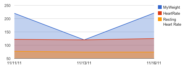
This will go through all posts that have a custom field called “Heart Rate” and plot them on a nice Google Chart Tools LineChart. If you wanted to work with more points of data, simply add more Custom Fields:
[plotovertime field1="Heart Rate" field2="Weight" field3="Workout Time"]
Plot Over Time support up to 10 fields per graph.
The legend is automatically added, and each datapoint is able to be clicked to get a callout about it’s datapoint. If you want to get rid of the legend:
[plotovertime field1="Heart Rate" legend="none"]
Or you can move the legend around with legend=”left” or legend=”right”.
To use other types of graphs:
[plotovertime field1="Heart Rate" type="BarChart"]
Valid types chart types for Plot Over Time are: AreaChart, LineChart, PieChart (not particularly useful in this implementation), BarChart, and ColumnChart.
You can set your own width and height for the chart with Width and Height:
[plotovertime field1="Heart Rate" width="500" height="300"]
By default, Plot Over Time uses ALL data from all posts and pops it onto a graph. You can limit it with two options:
1) You can determine the maximum number of days worth of data (starting from now and going backwards) with maydays:
[plotovertime field1="Heart Rate" maxdays="30]
This would show a one month span of data.
2) You can attach a graph to that post’s published date with usepostdate:
[plotovertime field1="Heart Rate" usepostdate="true"]
So if the post was 3 weeks old, it would only show data from it’s publication date of three weeks ago and older.
The date format defaults to m/d/y – IE, 12/31/11. You can change it with dateformat:
[plotovertime field1="Heart Rate" dateformat="Y-m-d"]
Would instead put 2011-12-31 on the graph.
And finally: Don’t like the colors of the graph, or want to add a few new options? No problem – any Google Visualization Tools options is available using the option parameter:
[plotovertime field1="Heart Rate" options="title: 'My Cool Graph!';"]
This would add a title above your graph that reads “My Cool Graph!”. Note – don’t change the height or width using the options=”height: “, instead use height=”300” or similar. Changing it in the options that are passed to the graph won’t change the size of the div it exists in.
For more information on the options available visit the Google Chart Tools homepage: http://code.google.com/apis/chart/index.html
And of course, you can mix and match any of the shortcode commands in any way you want. have fun!
Now, about that data… you’ll want to know a couple of rules.
First, if you define 5 fields you want to read from, and a post only had four fields? It’s going to ignore you.
Second, it doesn’t do data interpolation. If there’s a gap in your data, it simply ignores it – it doesn’t give it a “0”, it just plain doesn’t plot it. (That’s how I wanted it. Other opinions may differ.)
Third, if you tell it you want to see 30 days of data, and you’ve only got three days of data in your posts? It’s only going to show a graph that spans three days.
All data integrity is up to you.
And it will pull data from ALL posts, not just posts in a specific category. For future updates I’ll probably add a category field that allows you to pull data from a single category.
This plugin is a quick “one off” I did for myself – it’s not nearly as pretty or efficient as it could be, and I’ll probably do some refactoring on it in the future if there’s any interest. Plus, there’s probably a couple of other things I’ll add down the road as the whim strikes.
Ecrãs
Instalação
- Download the Plot Over Time plugin and you will get a directory called “plotovertime” when you unzip the downloaded file. Upload the “plotovertime” directory to your wordpress plugins directory (e.g.
/wp-content/plugins/) - Activate the plugin through the ‘Plugins’ menu in the WordPress dashboard.
Perguntas frequentes
None, yet.
Avaliações
Este plugin não tem avaliações.
Contribuidores e programadores
“Plot Over Time” é software de código aberto. As seguintes pessoas contribuíram para este plugin:
ContribuidoresTraduza o “Plot Over Time” para o seu idioma.
Interessado no desenvolvimento?
Consulte o código, consulte o repositório SVN, ou subscreva o registo de alterações por RSS.
Registo de alterações
Verison 1.0, November 18, 2011 – Initial Release


